Introduction
I created my own font using various applications and tools. I first had to do some brainstorming before I found what style I wanted to use. I also included some pictures to explain some unfamiliar vocabulary related to fonts.Description
 |
| alphabet |
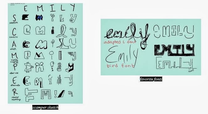
The first step toward creating my own font was to become inspired by other fonts. I typed "interesting fonts" into Google and scrolled through the images. When I came across a style I liked, I drew a little sketch on my tablet to remind me to try and incorporate it into my own font. After I gathered enough inspiration, I started sketching by using the "SCAMPER" method, which stands for substitute, combine, adapt, modify or magnify, put into another use, eliminate, and reverse or rearrange. I opened Microsoft Onenote on my tablet to brain storm since it was easy to sketch and save images without tons of eraser marks. For each letter in my name, I substituted something, combined different elements, etc. For example, I decided to magnify the top part of the letter "e" and "i," but I also put those letters into different uses: a summation sign in math and a balloon, respectively. After I completed my scamper sketch, I chose a few of my favorite fonts to finish writing my name. I really like the my "adapted L" font, so I decided to imagine my name written in that style as a background wallpaper. I drew thorns coming out of my name, and then I wanted to draw a bird perched on the thorn branch, so I just wrote the word bird. However, a spark went off in my head when I saw the word "bird," so I decided to write my name in that style and add it to my collect of favorite fonts. Since I would have to finish my project in Adobe Illustrator, I decided to start drawing my favorite font, the "adapted L" font, in Illustrator. Despite my love for that font, it took too long to create; within one class period I was only able to finish the letter "e." I knew this font
was a little impractical and over complicated.
Instead, I decided to expand on the "bird font."
Creating the Font
After my experience using Illustrator to create my "adopted L" font, which has smooth lines, I decided to create my alphabet in Onenote on my tablet instead. It was much quicker since I could make precise lines because it was as if I was drawing on a piece of paper instead of using the pen and/or pencil tool with my mouse on a desktop. I first created a few lines, the top, cap, mean, base, and beard lines, to guide my font. Then started drawing my letters, numbers, and symbols. I first start off with a skeleton by quickly drawing the character so
the line is fluid instead of choppy. Then I go back and make certain lines thicker than others. For example, I quickly drew an "n," but then I went back with my pen and made its shoulder thicker. Besides my repeated
 |
| steps to creating a letter |
After I finished drawing my alphabet, I saved each character as a jpeg using the screenshot button. Then I
imported the pictures to Illustrator. I used what I learned during last project and converted the images into was workable lines with anchor points and handles by clicking on image trace, expand, and ungroup. Then I deleted the background color, which I set to mint green (as seen in my scamper sketch) so it would be easy to see what I needed to delete, so I could just manipulate the lines. From there I regrouped the lines for each character and arranged them in alphabetical order on the same lines as before, top, cap, mean, base, and beard. When that was done, I magnified my screen so I could see the details of each letter so I could alter what I needed. I enlarged a few letters so they would touch the cap and base lines, and in some cases I used the anchor points and handles to make the curves smoother. However, since I did import pictures, image trace already created fluid lines since it uses the general shape and ignores the little imperfections, which were also not captured using the screenshot button on a zoomed out screen.
Anatomy of Typography
After I finished my font, I went ahead and figured out the different features of my font, such as the strokes, connectors, terminals, holes, and other aspects, generally colored blue, green, red, orange, and black. Below are some of the different features of my font.
