Showing posts with label graphic design. Show all posts

Friday, February 14, 2014

Gestalt Design Principles

link

Introduction

I will be speaking about the Gestalt design principles and how they relate to graphic design. Gestalt means 'unified whole,' a common way to also describe graphic design where elements are arranged in such a way that the end design looks more connected, coherent, and complete. When we look at visual information, our brains cannot take it all in, so we sort out what is most important. For example, our eyes pay attention to color value, meaning our brains focus on brightly colored objects when they are surrounded by a duller background since it makes the objects pop out, letting our brain choose the more important element. For this reason, I have colored important terminology in a higher color value (bright red) than the rest of my text so you will notice and hopefully remember the key words. However, if everything is brightly colored, then our brains cannot sort out what is the most important, making the picture appear to shake and our brains hurt. As a result, good graphic design uses ideas like this to accentuate vital elements without overwhelming the brain. Gestalt principles take advantage of the eye's basic cues to exemplify design, but before we get into his key ideas, let us understand where his principles come from.


History

During the 1920s German Psychologists, such as Max Wertheimer, Wolfgang Kohler, and Kurt Koffka, hypothesized theories about visual perception: the specific arrangements of elements that let viewers group different objects into a single design. Over the next thirty years, these theories were developed even further, catalyzed by Rudolf Arnheim's book, Art and Visual Perception: A Psychology of the Creative Eye. In Arnheim's book, he summarizes the six Gestalt principles below.


Principles

Similarity

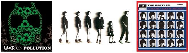
It is important to incorporate similarities throughout design, for like elements are not seen as individual objects, but rather as a pattern or group. A simple illustration can be created by a series of similar, but separated, elements. In the pictures below, the one to the left is not just a mass of recycling symbols, but also a villainous mask. Using this principle, the graphic design artist was able to portray recycling, evil, and its connection in a nice design. Our mind picks out the important elements, revealing the shape of a mask. However, the middle picture has an anomaly, the shorter girl. She is different since she is surrounded by taller people, grabbing our attention. The album cover to the right uses a combination of similarities, all pictures are of the same person, and anomalies, each picture has the person making a different facial expression. In these designs there are repetitions of similar objects: recycling symbols and people.
link                                                                           link                                                                       link

link
                                                                                                                                       
In this example, there are similarities between the Pepsi logo and the smiles, but anomalies between the different expressions. This design uses Gestalt's principle to exemplify that Pepsi brings all different smiles to people.


Continuation

                    link                                                                        link                                                     link

This is the principle that involves the path your eye follows.  As seen in the
images above,it is natural to follow specific patterns. For example, in the
link
picture to the left, your eye naturally follows the light blue path, and in the middle picture, your eye makes up the most obvious path to connect the two dotted paths which is hidden by the black rectangle; the path is a straight line, not a billion loops, under the rectangle. As for the image to the right, when you see two curvy lines of the same color, you naturally assume they are two lines crisscrossing on top of each other, not two separate lines connecting at a point. Graphic design draws your attention by using your natural eye direction. Since you only absorb the important information, continuity makes the job easier by showing viewers what the artist thinks is vital, which will hopefully be remembered after a quick glance. In the picture directly to the right, your eye continues in the direction of the design and you see Waldo. In the picture below, the continuity draws your eye to the soccer ball, making you associate it with the word "UMBRO."
link


Closure

link
This principle incorporates the technique of using gaps in figures. Your mind will supply the information to connect the pieces and fill in the composition. Since your brain tries to decrease the amount of information it takes in, it groups the pieces and gaps into a unit. Humans have a tendency to see closed shapes, so closure is in affect when an object is incomplete or its interior space is not fully closed. However the viewer perceives the shape by filling in the missing information. In the surrounding pictures, a sphere, dog, fork, bottles, and square are not drawn, but can be seen since they are blocked off, grouped, and cut out by surrounding elements.Some approach this idea by drawing lines to correctly place objects, and later they erase the boundaries to create the illusion of a closed figure.


link                                                                      link                                                                        link


Proximity and Alignment

link


link


The relationship of one object to another is important when creating design. When certain objects are close, they are grouped together. This principle was also mentioned under "similarities," referring to the recycling symbols. There not only was a repetition of symbols, but they were also considered a unit, the villainous mask. The birds to the right are perceived as a person because of their proximity whereas the birds to the left are perceived as separate units since their proximity does not
link
form any pattern. Similarly, the black blocks in the image below are so far apart that they cannot be considered a unit. However, the images below and to the left contain the same number of circles, but their proximity is different, making their figures different: a square verses lines. Moreover, the images below and to the right are perceived the same, a square, even though they are made up of different elements since they have the same proximity. Also depending on proximity, objects can give the illusion of depth; the triangles in the picture above become smaller and further away, appearing as if they are off in the distance. Many approach this principle as if the objects were placed on a grid, where grouped elements would follow the same lines on the grid and be within only a few blocks on the grid.                                                  
     link                                                                   link                                                   link


Figure/Ground

link

This concept uses the idea of light and dark shading to make specific images pop, similar to how I color coded the terminology. Objects in the foreground are seen as the figures and the surrounding area is called the ground. There can by ambiguity, where the designer intentionally allows some figures and ground to not fully express their roll as a form, shape, or silhouette. However, there is
link
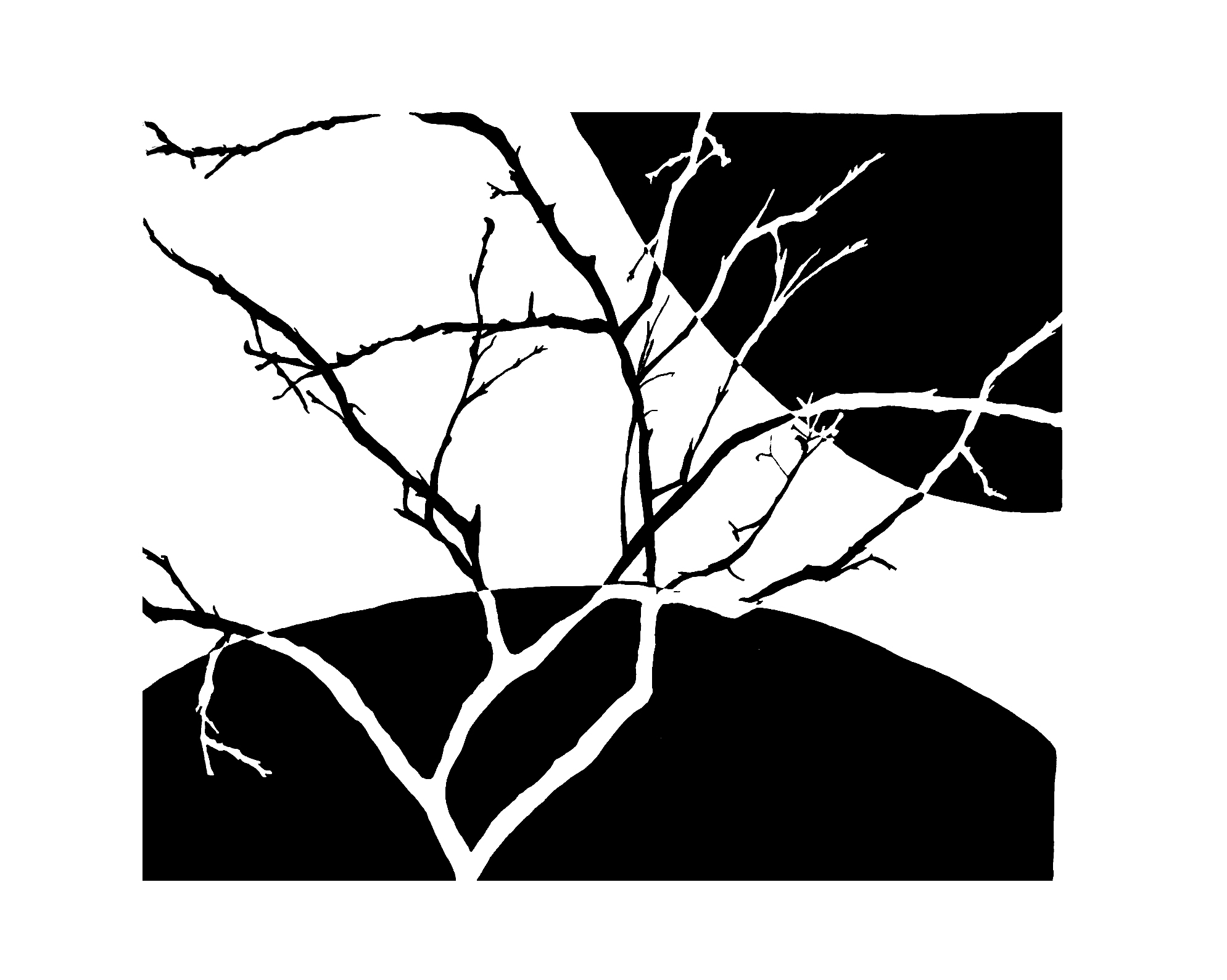
always this tendency to see, focus, and separate the figures and ground. The background can either help accentuate the figure or be another figure entirely. In the above picture, you can perceive the figure to be two turtles or the ground to be the liberty bell. However in the figure to the left, the ground helps exemplify the figure, tree. Although the tree essentially ends when its black branches morph into the surrounding area, you can still see the tree with the help of the ground to create negative space. The background provides the visual cues to see the figure. In the image below, the figures on the left side of the picture are white while the figures on the right side of the picture are black, but in the middle the figures mold into the ground, where it becomes ambiguous. It is uncertain to which color is the ground and figure because they do not stay constant throughout the image, as well as, where the ground and figures change roles for they morph in and out of one another. The appearance of the figure and ground, though they look simple, play a large role in graphic design.
link


Symmetry and Order

Symmetry and order are important in a composition in order to avoid a sense of disorder or imbalance. This way, viewers can focus on the design's message and construction rather than trying to locate the missing element or fix the problem. You can apply symmetry and order by using techniques like the windmill (two to the left) where everything follows the same pattern in the shape of a circle, vertical flip (middle), and horizontal mirror (right), providing your viewer with a sense of harmony. Great graphic design uses combinations of these Gestalt design principles.

                  link                                                       link                                                link                                              link


Terminology

1) Unified Whole: a design that is connected, coherent, and complete; goal in graphic design;
    separate parts that create the sense of a grouped composition.

2) Color Value: amount of light released from a color; relative value on a grey scale.

3) Anomaly: a different object surrounded by similar elements, making the unique shape stick out.

4) Path: direction the design makes your eye follow.

5) Interior Space: the gap inside of a figure, which, in the principle of closure, is not bound.

6) Grouping: certain objects are so close that they are perceived as a unit.

7) Ambiguity: there is uncertainty if some figures and ground are a form, shape, or silhouette.

8) Windmill: repeating a pattern in the shape of a circle.

9) Vertical flip: flipping an image over the y-axis.

10) Horizontal mirror: reflecting an image over the x-axis.

11) Perception: how we interpret design.

12) Figure: shape that an object or group of objects illustrate.


References

1. Since I did not make the pictures presented in this blog post, a link to where I found each picture is provided as the picture's caption.

2.  http://www.creativebloq.com/graphic-design/designer-s-guide-gestalt-theory-10134960

3. http://www.slideshare.net/thompsonkaren/gestalt-design-principles-and-infographics-15828783

Sunday, February 2, 2014

Quote

Introduction

I created a poster with an inspirational quote about a philosophical view of music. During this project I designed a font and used basic shapes.

Description

First I had to choose my quote, so I searched Google
for some inspiration. I decided to narrow
Scamper Matrix
down my choices to ones that pertains to music since music is a big part of my life. A few contenders were "Music is what feelings sound like," and "When pain penetrates, music resonates," but I decided to go with "Music begins where the possibilities of language end" since it smoothly ran together without sounding corny. Next I started brainstorming ideas by organizing possibilities for my poster in a scamper matrix. Then I combined a few of my favorite ideas in a final thumbnail and used this thumbnail for the layout of my poster.

Opening up Illustrator, I started to design my poster. I
first created my cymbal using the pen tool. I copied the
overall shape, re-sized it, and deleted specific anchor
points to make the rings of the cymbal. Then I realized
Final Thumbnail
if I added the french horn and cassette, the pictures would take away from the words. I decided to just leave the cymbal there since I thought it looked nice and I wanted to incorporate my love for percussion in the poster. Next I created staff lines which I will use as the basis for my text and connect a few to the cymbal. I choose to make a few of the cymbal rings and staff lines different stroke thicknesses so the poster did not look boring. Then I used the rectangle tool to make a background. I added a gradient between two colors: magenta and grey. These colors
make the center pop which is where I was going to put
the words.

I started writing the word "possibilities" and decided it
would look neat if I made the center of the word look
squished, so I made the beginning and ending letters
wider. Since I was not using the cassette, I thought I
Final Poster
could combine the word with the staff line by leaving the bottom of letters open and joining the sides with the line. After I finished that word, I decided to make the other words just rest above the line so I could make the word "possibilities" stick out. I used the pen tool to make the other letters and created a font that looked smooth and simple. I by accidentally forgot to line up the letters but thought it looked cool that the letters did not exactly follow the same base line, so I continued this pattern. After I finished the other
letters, I colored them different colors while still
matching the same scheme as my background.

Analysis

This is one of my favorite projects because it is practical; I am very excited to hang this poster in my music room! The most interesting part of this project was figuring out how to make the rings of my cymbal and combine the word "possibilities" with the staff line. However, the most difficult part was deciding on the colors so they look like they belong without fading too much into the background. I overcame my obstacle by trying different combinations of colors by creating new swatches. If I had more time I could have probably made the word "possibilities" look more symmetric. Each aspect (cymbal, lines, and background; the word "possibilities;" and the other words and choosing the colors) took approximately the same time to complete. This project is about a 5/10 for difficulty depending on how complex the poster design is. I am very proud of my final result and believe my effort deserves a 10/10!

Thursday, January 9, 2014

Font

Introduction

I created my own font using various applications and tools. I first had to do some brainstorming before I found what style I wanted to use. I also included some pictures to explain some unfamiliar vocabulary related to fonts.

Description

alphabet
Brainstorming
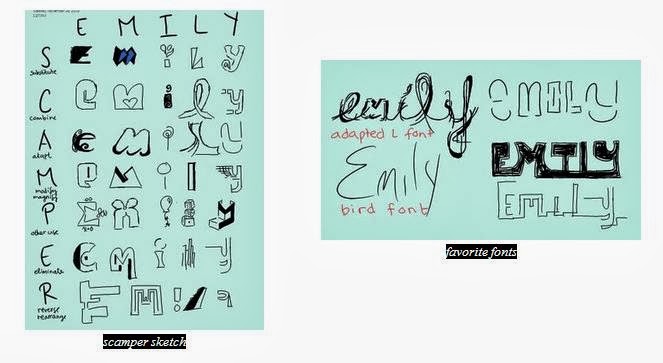
The first step toward creating my own font was to become inspired by other fonts. I typed "interesting fonts" into Google and scrolled through the images. When I came across a style I liked, I drew a little sketch on my tablet to remind me to try and incorporate it into my own font. After I gathered enough inspiration, I started sketching by using the "SCAMPER" method, which stands for substitute, combine, adapt, modify or magnify, put into another use, eliminate, and reverse or rearrange. I opened Microsoft Onenote on my tablet to brain storm since it was easy to sketch and save images without tons of eraser marks. For each letter in my name, I substituted something, combined different elements, etc. For example, I decided to magnify the top part of the letter "e" and "i," but I also put those letters into different uses: a summation sign in math and a balloon, respectively. After I completed my scamper sketch, I chose a few of my favorite fonts to finish writing my name. I really like the my "adapted L" font, so I decided to imagine my name written in that style as a background wallpaper. I drew thorns coming out of my name, and then I wanted to draw a bird perched on the thorn branch, so I just wrote the word bird. However, a spark went off in my head when I saw the word "bird," so I decided to write my name in that style and add it to my collect of favorite fonts. Since I would have to finish my project in Adobe Illustrator, I decided to start drawing my favorite font, the "adapted L" font, in Illustrator. Despite my love for that font, it took too long to create; within one class period I was only able to finish the letter "e." I knew this font 
was a little impractical and over complicated. 
Instead, I decided to expand on the "bird font."


Creating the Font
After my experience using Illustrator to create my "adopted L" font, which has smooth lines, I decided to create my alphabet in Onenote on my tablet instead. It was much quicker since I could make precise lines because it was as if I was drawing on a piece of paper instead of using the pen and/or pencil tool with my mouse on a desktop. I first created a few lines, the top, cap, mean, base, and beard lines, to guide my font. Then started drawing my letters, numbers, and symbols. I first start off with a skeleton by quickly drawing the character so 
the line is fluid instead of choppy. Then I go back and make certain lines thicker than others. For example, I quickly drew an "n," but then I went back with my pen and made its shoulder thicker. Besides my repeated 
steps to creating a letter
feature of fluid lines, I also include the contrast between thick and thin curves. Another theme I included is open counters; as you can see from my alphabet, my "o," "a," "g," etc. are not completely closed or connected. Similarly, I did not connect other lines, such as the crossbar to the strokes in my "A" and the bowl to the stem of my "p." Also many of my characters' descenders and ascenders purposefully extend beyond the cap, mean, and base lines.  

After I finished drawing my alphabet, I saved each character as a jpeg using the screenshot button. Then I 

imported the pictures to Illustrator. I used what I learned during last project and converted the images into was workable lines with anchor points and handles by clicking on image trace, expand, and ungroup. Then I deleted the background color, which I set to mint green (as seen in my scamper sketch) so it would be easy to see what I needed to delete, so I could just manipulate the lines. From there I regrouped the lines for each character and arranged them in alphabetical order on the same lines as before, top, cap, mean, base, and beard. When that was done, I magnified my screen so I could see the details of each letter so I could alter what I needed. I enlarged a few letters so they would touch the cap and base lines, and in some cases I used the anchor points and handles to make the curves smoother. However, since I did import pictures, image trace already created fluid lines since it uses the general shape and ignores the little imperfections, which were also not captured using the screenshot button on a zoomed out screen. 


Anatomy of Typography

After I finished my font, I went ahead and figured out the different features of my font, such as the strokes, connectors, terminals, holes, and other aspects, generally colored blue, green, red, orange, and black. Below are some of the different features of my font.

Reflection

I enjoyed this project. Figuring out what method to efficiently use to create my characters was the toughest part of this process. It took me a whole class to draw the intricate "e" from the "adapted L" font, so I knew using the pen and/or pencil tool on Illustrator was not a realistic option for me. However, once I thought of using my tablet to draw letters, then save, drag, and convert the characters in Illustrator, the rest of the project came easily. I worked well with manipulating my lines with anchor points and handles. When I was creating my "Anatomy of Typography" picture, I found it usefully to copy the letter and paste it on top of itself, color it, then delete anchor points to condense the letter to highlight just the feature. I will remember that deleting anchor points may help me accomplish my goal, for it was something I never thought of doing before but is very helpful. I learned so much about fonts, from the vocabulary to how they are formed. I would have never thought twice about how many different strokes there are; it is interesting that there are even several lines to help guide a font. I would rate this project as a 3.5/10 for difficulty, but I believe my performance is worth a 10/10 for all the extra hours I put into making sure my font, as well as its anatomy, were flawless.

Next Step

After completing a font by using a computer, you can try transforming your own handwriting into a font of its own.

Friday, November 1, 2013

Spaceship


Introduction
For this project, I created a spaceship using and manipulating different shapes.

Description
To create my spaceship, I first used the ellipse tool, then copied, pasted, and shrunk the duplicate to use as the window. However, I had to get rid of the extra anchor point on the left side of the window, so I used the pen tool to delete it. Then I used rectangles to create the exhaust pipe. With the pen tool, I added an anchor point to the sides of the rectangle and transformed it to a handle. Then I copied and overlapped the spaceship several times and used the shape builder tool to delete the overlapping area to create the flame. I copied and shrunk the flame to make a smaller flame. Afterwards, I made the fins by overlapping the areas of a duplicate spaceship body and a square, then by using the shape builder tool, I delete the overlapping area. I also made shadows by coloring the shape of the shadow to black and changing the opacity to 20%. In addition I added a gradient to the spaceship by using a gradient tool. Then I made the outline thicker by copying the whole ship, putting the duplicate behind the original, and changing all it's strokes to 7. Lastly, I rotated my ship, added a background color and stars, and admired my project, which is above and to the right!

Reflection
Throughout the process of creating this spaceship, I came across some bumps as well as some surprises. The most difficult task was finding the tool, such as the shape builder tool. The tutorial said to use tools I could not find. Instead, I interpreted what the directions wanted me to do, and then created the end product by using the tools I could find. The most rewarding part of my project was when I finally figured out how to use the shape builder tool. From then on, I excelled in that area. I was also successful at manipulating the shapes by using the pen tool. Into the future, I will remember how to use the shape builder tool since I learned how to manipulate it. The most interesting part of my project was operating the pen tool. It was intriguing how I could delete anchor points and transform them to handles using the pen tool. I always thought of the pen tool as just a drawing device, but never as a manipulative tool. Overall, this project was about a 7/10 for challenging, but I believe my performance deserves a 10/10!

Next Step
For more work using shape builder tool and pen tool, I would look at this video! It uses the idea of combining shapes instead of deleting the overlapping area, so you can use this idea to let your imagination soar and create even more shapes!