Thursday, January 9, 2014

Font

Introduction

I created my own font using various applications and tools. I first had to do some brainstorming before I found what style I wanted to use. I also included some pictures to explain some unfamiliar vocabulary related to fonts.

Description

alphabet
Brainstorming
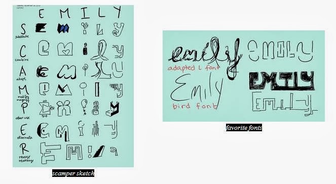
The first step toward creating my own font was to become inspired by other fonts. I typed "interesting fonts" into Google and scrolled through the images. When I came across a style I liked, I drew a little sketch on my tablet to remind me to try and incorporate it into my own font. After I gathered enough inspiration, I started sketching by using the "SCAMPER" method, which stands for substitute, combine, adapt, modify or magnify, put into another use, eliminate, and reverse or rearrange. I opened Microsoft Onenote on my tablet to brain storm since it was easy to sketch and save images without tons of eraser marks. For each letter in my name, I substituted something, combined different elements, etc. For example, I decided to magnify the top part of the letter "e" and "i," but I also put those letters into different uses: a summation sign in math and a balloon, respectively. After I completed my scamper sketch, I chose a few of my favorite fonts to finish writing my name. I really like the my "adapted L" font, so I decided to imagine my name written in that style as a background wallpaper. I drew thorns coming out of my name, and then I wanted to draw a bird perched on the thorn branch, so I just wrote the word bird. However, a spark went off in my head when I saw the word "bird," so I decided to write my name in that style and add it to my collect of favorite fonts. Since I would have to finish my project in Adobe Illustrator, I decided to start drawing my favorite font, the "adapted L" font, in Illustrator. Despite my love for that font, it took too long to create; within one class period I was only able to finish the letter "e." I knew this font 
was a little impractical and over complicated. 
Instead, I decided to expand on the "bird font."


Creating the Font
After my experience using Illustrator to create my "adopted L" font, which has smooth lines, I decided to create my alphabet in Onenote on my tablet instead. It was much quicker since I could make precise lines because it was as if I was drawing on a piece of paper instead of using the pen and/or pencil tool with my mouse on a desktop. I first created a few lines, the top, cap, mean, base, and beard lines, to guide my font. Then started drawing my letters, numbers, and symbols. I first start off with a skeleton by quickly drawing the character so 
the line is fluid instead of choppy. Then I go back and make certain lines thicker than others. For example, I quickly drew an "n," but then I went back with my pen and made its shoulder thicker. Besides my repeated 
steps to creating a letter
feature of fluid lines, I also include the contrast between thick and thin curves. Another theme I included is open counters; as you can see from my alphabet, my "o," "a," "g," etc. are not completely closed or connected. Similarly, I did not connect other lines, such as the crossbar to the strokes in my "A" and the bowl to the stem of my "p." Also many of my characters' descenders and ascenders purposefully extend beyond the cap, mean, and base lines.  

After I finished drawing my alphabet, I saved each character as a jpeg using the screenshot button. Then I 

imported the pictures to Illustrator. I used what I learned during last project and converted the images into was workable lines with anchor points and handles by clicking on image trace, expand, and ungroup. Then I deleted the background color, which I set to mint green (as seen in my scamper sketch) so it would be easy to see what I needed to delete, so I could just manipulate the lines. From there I regrouped the lines for each character and arranged them in alphabetical order on the same lines as before, top, cap, mean, base, and beard. When that was done, I magnified my screen so I could see the details of each letter so I could alter what I needed. I enlarged a few letters so they would touch the cap and base lines, and in some cases I used the anchor points and handles to make the curves smoother. However, since I did import pictures, image trace already created fluid lines since it uses the general shape and ignores the little imperfections, which were also not captured using the screenshot button on a zoomed out screen. 


Anatomy of Typography

After I finished my font, I went ahead and figured out the different features of my font, such as the strokes, connectors, terminals, holes, and other aspects, generally colored blue, green, red, orange, and black. Below are some of the different features of my font.

Reflection

I enjoyed this project. Figuring out what method to efficiently use to create my characters was the toughest part of this process. It took me a whole class to draw the intricate "e" from the "adapted L" font, so I knew using the pen and/or pencil tool on Illustrator was not a realistic option for me. However, once I thought of using my tablet to draw letters, then save, drag, and convert the characters in Illustrator, the rest of the project came easily. I worked well with manipulating my lines with anchor points and handles. When I was creating my "Anatomy of Typography" picture, I found it usefully to copy the letter and paste it on top of itself, color it, then delete anchor points to condense the letter to highlight just the feature. I will remember that deleting anchor points may help me accomplish my goal, for it was something I never thought of doing before but is very helpful. I learned so much about fonts, from the vocabulary to how they are formed. I would have never thought twice about how many different strokes there are; it is interesting that there are even several lines to help guide a font. I would rate this project as a 3.5/10 for difficulty, but I believe my performance is worth a 10/10 for all the extra hours I put into making sure my font, as well as its anatomy, were flawless.

Next Step

After completing a font by using a computer, you can try transforming your own handwriting into a font of its own.

Monday, November 25, 2013

Pikachu's Campaign

Introduction
I created an election poster and button for Pikachu's campaign for major. I first researched different styles of election posters then used Adobe Illustrator and Photoshop to bring my ideas to life.

Description-how I created the poster
Character
My goal was to create an election poster for a cartoon 
character, so naturally, my first thought was to decide what cartoon to center my campaign around. I thought Pikachu would be a good candidate since he is adorable and many people can reminisce about their childhood memories, playing Pokemon and watching the television show, while looking at my poster. I went on google images and searched for a cute Pikachu image. Then I dragged the image onto my election poster, an 11"x17" landscape file in Illustrator. While clicking on the image, I opened up the image trace window. From there I traced, ungrouped, and expanded the image. This way I could manipulate the image. I ended up keeping the same colors and proportions as the original image, but I delete the white background. As a result, when I place my traced image on top of a colored background, there will not be a white square background surrounding my image. My result, traced image is on the right. 

Text
Next I came up with a slogan. I choose "Pikachu is for you" since it was catchy, and therefore, it would stick in the voters' minds. I wrote "Pikachu" in all capital letters with a yellow color and navy stroke. To make the text color the same shade of yellow as the Pikachu character, I used the color picker and assigned the new yellow color as a new swatch. Afterward I clicked on the word with the black arrow and pulled on the corners to enlarge the text. Then I right clicked and selected outline so I could manipulate the shape of the text to look more appealing and unique. I repeated these steps for the words "Is For" and "You." I made these two different text groups so I could rearrange the spacing between the two lines. I set the color to navy and the outline to light blue to contrast with the word "Pikachu," effectively accentuating my candidate.

Extras
Then I added some extra visual effects. I placed a background behind Pikachu to help the character stick out and to add some flavor to the poster. I first added a navy rectangle with a light blue stroke color to complement the words "Is For" and "You" to help the poster tie together. Then I used the 3D effect to tilt the rectangle in an interesting position. After I was finished with Pikachu's background, I placed a few white stars with a maroon stroke around the poster. I wanted to complement the null space and show my candidate's patriotism, which is also why I strung the theme of red, white, and blue throughout my poster. Within my theme I also used hints of yellow since Pikachu is yellow. Lastly, I created a background for my entire poster by adding a large rectangle, changing its order so it is behind all the words, stars, and other images, and assigning its fill color to be red.

Touch-ups
Finally, I made some touch ups. My original poster looked like the photo below. However, after
talking with a few people, I discovered that my poster could use a couple of improvements. The people with whom I talked to suggested that the word "Pikachu" should be the largest item on the poster because potential voters will quickly glance at the poster as they drive in their cars, so the name should stick in their heads, effectively triggering them to vote for my candidate. As a result, I needed to make the character and words "Is For You" smaller. Then I thought it helpful to have what my candidate was running for, so I added "Vote Him Mayor" to my poster. Then I noticed the "K" in "Pikachu" was touching the "A," so I ungrouped the word and moved the "A" a little more to the right. I looked back at my poster and realized there was a lot of empty space after resizing the words and character, so I made the poster flow together with a few more stars. I also added three stars between "Is For You" and "Vote Him Mayor" to divide the phrases from one another and help distinguish them apart. My finished election poster is shown below.

Button
After my poster was finished, I decided to make a button to help promote my candidate. I made the background image in Illustrator. First I made a 2.75 unit circle with a line through the center. Second, I used the shape builder tool to divide the circle into two different shapes. I made the the top semicircle red and the bottom semicircle navy with a white line in the middle and yellow text on the left to relate to the color theme of my poster. The text also allows viewers to know the purpose of the button. Next I added Pikachu to the right of the circle and again used the shape builder tool, but this time to delete the extra parts of the image that were outside of the circle. Lastly I added three white stars to show the similarity between my button and my election poster. After I saved the image I made on Illustrator, I added it to Photoshop. From here I just worked in Photoshop. On top of my image I created another circle, to which I added a couple effects, such as a shadow and
highlight, making it appear 3D. However, I needed to reduce the visibility so my image that I created in photoshop would shine through while the effects of my new circle would still be seen. Then I created a gloss to the button by adding a radial gradient that started from white to nothing in the oval outline from the elliptical marquee tool on the top of my button. Lastly, I create another highlight by create a similar oval outline, but this time I rotated it to the right and used the eraser tool so there would only be a little glare showing. To the left is my finished button. The combination of both my effective election poster and button, Pikachu's chances for being elected major are definitely increased!
Reflection
Using Illustrator and Photoshop to create an election poster and button was something that I have never done before, and honestly, I would have never thought of using such programs to accomplish these tasks. Throughout this process, I found that I did very well with understanding how to use image trace and manipulating the anchor points on the text. However, using Photoshop was a whole new experience. This has been my second month using Illustrator, and I just finally started to get use to the format, but when I opened up Photoshop I became completely lost. I ran into a bunch of brick walls from trying to click on my image that I imported from Illustrator to creating the radial gradient with the elliptical marquee tool. I overcame these challenges by asking my neighbors how they went about using Photoshop. I also looked on YouTube to see if there were any tricks I could learn. Additionally, I also played around with the different tools to discover if there was something I overlooked or another tool I could use. After a while of searching, I finally figured out I needed to click on my image with a specific arrow tool, and that even though I was administering the gradient effect, it was in the wrong layer, so my effect could not be seen. One thing that I was able to accomplish very well in Photoshop was creating the effects on the circle which I placed on top of my image I imported from Illustrator. I could follow the tutorial very clearly once I opened up the effects' window. I was able to switch the filters, change the numbers, and swap the images within the window to the ones that were on the tutorial. After this whole process, I will probably remember the importance of layers in Photoshop, for that stumped me for a long time, and once I figured it out, it was that AHA moment that whenever I would run into another problem on Photoshop, I immediately checked my layers to see if it was somehow related. I learned how to use Photoshop, but the aspect of this project that I found most interesting was how after only two months, I was able to work in Illustrator without any problems or bumps in the road. I believe that this project was a 9 out of 10 for challenging since I ran into a couple of obstacles while working on the button, but I worked extremely diligently so I believe my performance deserves a 10 out of 10!

Friday, November 1, 2013

Spaceship


Introduction
For this project, I created a spaceship using and manipulating different shapes.

Description
To create my spaceship, I first used the ellipse tool, then copied, pasted, and shrunk the duplicate to use as the window. However, I had to get rid of the extra anchor point on the left side of the window, so I used the pen tool to delete it. Then I used rectangles to create the exhaust pipe. With the pen tool, I added an anchor point to the sides of the rectangle and transformed it to a handle. Then I copied and overlapped the spaceship several times and used the shape builder tool to delete the overlapping area to create the flame. I copied and shrunk the flame to make a smaller flame. Afterwards, I made the fins by overlapping the areas of a duplicate spaceship body and a square, then by using the shape builder tool, I delete the overlapping area. I also made shadows by coloring the shape of the shadow to black and changing the opacity to 20%. In addition I added a gradient to the spaceship by using a gradient tool. Then I made the outline thicker by copying the whole ship, putting the duplicate behind the original, and changing all it's strokes to 7. Lastly, I rotated my ship, added a background color and stars, and admired my project, which is above and to the right!

Reflection
Throughout the process of creating this spaceship, I came across some bumps as well as some surprises. The most difficult task was finding the tool, such as the shape builder tool. The tutorial said to use tools I could not find. Instead, I interpreted what the directions wanted me to do, and then created the end product by using the tools I could find. The most rewarding part of my project was when I finally figured out how to use the shape builder tool. From then on, I excelled in that area. I was also successful at manipulating the shapes by using the pen tool. Into the future, I will remember how to use the shape builder tool since I learned how to manipulate it. The most interesting part of my project was operating the pen tool. It was intriguing how I could delete anchor points and transform them to handles using the pen tool. I always thought of the pen tool as just a drawing device, but never as a manipulative tool. Overall, this project was about a 7/10 for challenging, but I believe my performance deserves a 10/10!

Next Step
For more work using shape builder tool and pen tool, I would look at this video! It uses the idea of combining shapes instead of deleting the overlapping area, so you can use this idea to let your imagination soar and create even more shapes! 

Wednesday, October 16, 2013

Shapes


Introduction
For this project, I experimented with different tools, such as the pen, pencil, and direct selection tools, to create an array of objects and shapes.

Description
I created several shapes with the pen tool. I would click on different points around the perimeter of the object, and when there was a curve, I held my finger on the mouse as I moved the cursor to create a curve. As for the pencil tool, I held my cursor down and dragged it around the perimeter of the object. Once I was finished, the pencil tool created a nice border with few anchor points. Afterward, I used the direct selection tool to change the angle of my lines by clicking and dragging on the anchor points. Then I would fill the object, excluding the puzzle pieces, with a teal color to keep track of which shapes I finished. For the puzzle pieces I used a radial fill color that went from while to black. When I had to create a polygon, I used a specific tool: either the rectangle, star, or ellipse tool.


However, to create the watering can, I used different tools. I made rectangles and circles, and then used the shape builder tool to combine different shapes into one. Above and to the right is a picture of all the shapes I constructed, and to the left is an enlarged image on the watering can I created.


Reflection
I found this experience to be eye-opening. I started this project with no prior knowledge of illustrator, and through my work, I learned how to operate tricky tools, such as the pen tool. I did well with using the direct selection tool to tweak my drawings, but I found it difficult to try and create the object to near perfection on the first try with the pen tool. I felt successful after creating the watering can, for it looks nice, especially since I never even heard of the shape builder tool before. It is a pretty interesting feature, and I will remember it, and hopefully have the opportunity to use it again. Overall, I learned a lot about the basics of illustrator, from the pen to shape tool, and I found the direct selection tool to be the most interesting, for you can manipulate your work without having to reconstruct it. This project was about a 5/10 for challenging, since it required knowledge that I did not have, but after watching tutorials, I was able to figure it out. For my performance, I would give myself a 10/10 since I tried my hardest to complete each shape to the best of my ability while exploring different way of accomplishing the same goal.

Next Step
For further exploration for creating shapes, see this youtube video. After learning how to create 2d shapes, you can learn how to create a 3d shape!