 |
| link |
Introduction
I will be speaking about the Gestalt design principles and how they relate to graphic design. Gestalt means 'unified whole,' a common way to also describe graphic design where elements are arranged in such a way that the end design looks more connected, coherent, and complete. When we look at visual information, our brains cannot take it all in, so we sort out what is most important. For example, our eyes pay attention to color value, meaning our brains focus on brightly colored objects when they are surrounded by a duller background since it makes the objects pop out, letting our brain choose the more important element. For this reason, I have colored important terminology in a higher color value (bright red) than the rest of my text so you will notice and hopefully remember the key words. However, if everything is brightly colored, then our brains cannot sort out what is the most important, making the picture appear to shake and our brains hurt. As a result, good graphic design uses ideas like this to accentuate vital elements without overwhelming the brain. Gestalt principles take advantage of the eye's basic cues to exemplify design, but before we get into his key ideas, let us understand where his principles come from.History
During the 1920s German Psychologists, such as Max Wertheimer, Wolfgang Kohler, and Kurt Koffka, hypothesized theories about visual perception: the specific arrangements of elements that let viewers group different objects into a single design. Over the next thirty years, these theories were developed even further, catalyzed by Rudolf Arnheim's book, Art and Visual Perception: A Psychology of the Creative Eye. In Arnheim's book, he summarizes the six Gestalt principles below.Principles
Similarity
It is important to incorporate similarities throughout design, for like elements are not seen as individual objects, but rather as a pattern or group. A simple illustration can be created by a series of similar, but separated, elements. In the pictures below, the one to the left is not just a mass of recycling symbols, but also a villainous mask. Using this principle, the graphic design artist was able to portray recycling, evil, and its connection in a nice design. Our mind picks out the important elements, revealing the shape of a mask. However, the middle picture has an anomaly, the shorter girl. She is different since she is surrounded by taller people, grabbing our attention. The album cover to the right uses a combination of similarities, all pictures are of the same person, and anomalies, each picture has the person making a different facial expression. In these designs there are repetitions of similar objects: recycling symbols and people.
 |
| link link link |
 |
| link |
In this example, there are similarities between the Pepsi logo and the smiles, but anomalies between the different expressions. This design uses Gestalt's principle to exemplify that Pepsi brings all different smiles to people.
Continuation
 |
| link link link |
This is the principle that involves the path your eye follows. As seen in the
images above,it is natural to follow specific patterns. For example, in the
 |
| link |
 |
| link |
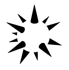
Closure
 |
| link |
 |
| link link link |
Proximity and Alignment
 |
| link |
 |
| link |
The relationship of one object to another is important when creating design. When certain objects are close, they are grouped together. This principle was also mentioned under "similarities," referring to the recycling symbols. There not only was a repetition of symbols, but they were also considered a unit, the villainous mask. The birds to the right are perceived as a person because of their proximity whereas the birds to the left are perceived as separate units since their proximity does not
 |
| link |
 |
| link link link |
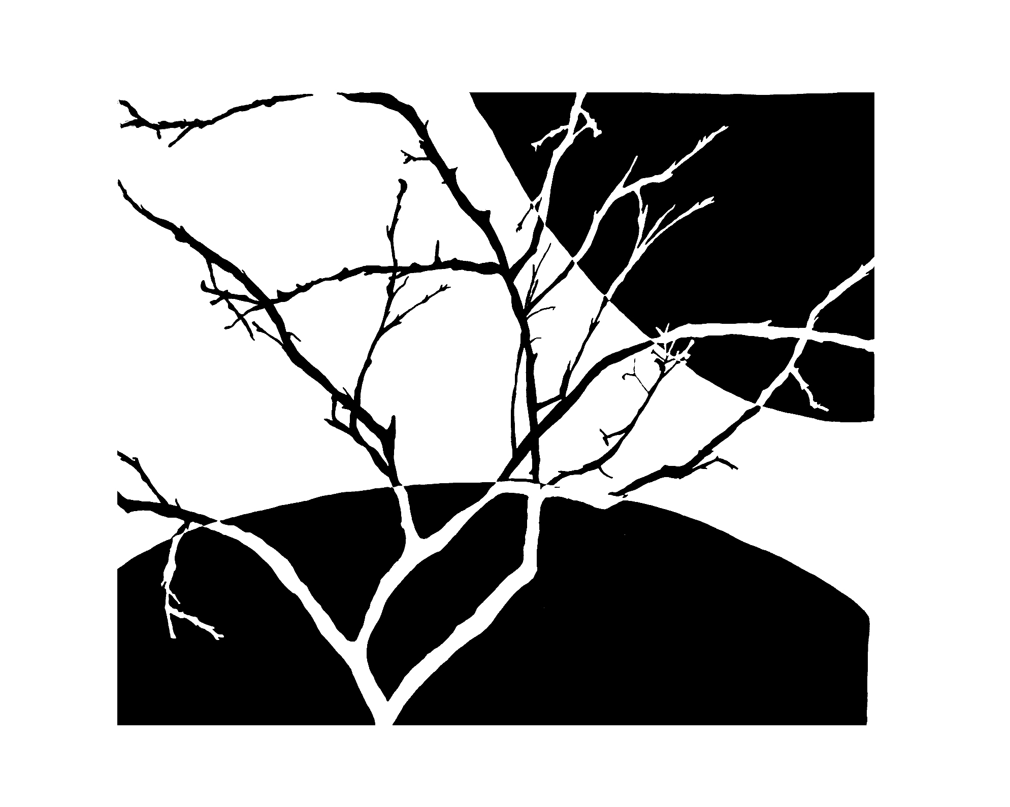
Figure/Ground
 |
| link |
This concept uses the idea of light and dark shading to make specific images pop, similar to how I color coded the terminology. Objects in the foreground are seen as the figures and the surrounding area is called the ground. There can by ambiguity, where the designer intentionally allows some figures and ground to not fully express their roll as a form, shape, or silhouette. However, there is
 |
| link |
 |
| link |
Symmetry and Order
Symmetry and order are important in a composition in order to avoid a sense of disorder or imbalance. This way, viewers can focus on the design's message and construction rather than trying to locate the missing element or fix the problem. You can apply symmetry and order by using techniques like the windmill (two to the left) where everything follows the same pattern in the shape of a circle, vertical flip (middle), and horizontal mirror (right), providing your viewer with a sense of harmony. Great graphic design uses combinations of these Gestalt design principles.
 |
| link link link link |
Terminology
1) Unified Whole: a design that is connected, coherent, and complete; goal in graphic design;separate parts that create the sense of a grouped composition.
2) Color Value: amount of light released from a color; relative value on a grey scale.
3) Anomaly: a different object surrounded by similar elements, making the unique shape stick out.
4) Path: direction the design makes your eye follow.
5) Interior Space: the gap inside of a figure, which, in the principle of closure, is not bound.
6) Grouping: certain objects are so close that they are perceived as a unit.
7) Ambiguity: there is uncertainty if some figures and ground are a form, shape, or silhouette.
8) Windmill: repeating a pattern in the shape of a circle.
9) Vertical flip: flipping an image over the y-axis.
10) Horizontal mirror: reflecting an image over the x-axis.
11) Perception: how we interpret design.
12) Figure: shape that an object or group of objects illustrate.
References
1. Since I did not make the pictures presented in this blog post, a link to where I found each picture is provided as the picture's caption.2. http://www.creativebloq.com/graphic-design/designer-s-guide-gestalt-theory-10134960
3. http://www.slideshare.net/thompsonkaren/gestalt-design-principles-and-infographics-15828783


.jpg)


